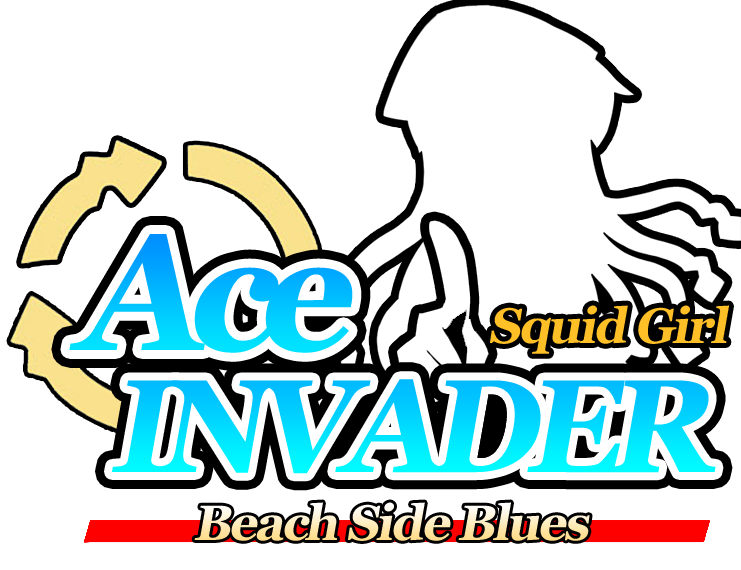
Wow, that title logo is pretty excellent, even the original logo circle..thing w/e you call it

How did you achieve a clean look regarding the squid girl's black outlines? It's pretty sharp compared to most AA fan title logo's I've seen. There's a little bit of blur I notice on the right side of the outline but nothing too bad.
Are you taking requests of sorts by any chance?
-------
Regarding the sprite itself:
I know you said it was the first one you made, but I'm going to provide crits to you so you can improve it in the future

:
1.) The mouth/lips movement compared to the rest of the sprite is real blurry.
2.) There are some serious pixellation issues regarding the outline of the sprite. That'll need some revamp as it's really noticeable.
3.) The hair looked pretty fine to me, until I start looking down at the two front "string hairs" going down...one looks like some messed up spaghetti, the other looks like a mutated/deformed pipe of sorts (the right one especially
)
4.) Your shading is top-notch, real pro, no real complaints here.
5.) On the front hair (covering the top part of the face), it's REALLY noticeably blurry compared to the rest of the sprite. You should get that fixed too. (My only complaint regarding that is probably a lack of a subtle shade here, but it's not necessary).
6.) The hat...looks really nice, but I don't know if it's a hat or some deflated chef's hat or something xP
7.) The overall shape of the sprite/appearance gives me the impression that this is indeed a young female of sorts. GJ on that.
Overall, keep up the good work, it's actually one of the best sprites I've ever seen for a first-time sprite


 Lvl 14
 Lvl 12
 Lvl 13