Adapted sprites by Ferdie Lance (critique encouraged)

Showcase your artistic creations, whether that be sprites, music, drawings or literature, and whether they be related to the Ace Attorney universe or not.

Moderators: EN - Assistant Moderators, EN - Forum Moderators

User avatar
Ferdielance
Posts: 778
Joined: Sun Mar 09, 2008 12:46 am
Gender: Male
Spoken languages: English

Re: Adapted sprites by Ferdie Lance (critique encouraged)

Post by Ferdielance »

Is it the font itself, the letter spacing, the outlining/contrast, the color, or something besides that? Would larger or smaller letters be better? Thinner or thicker? I can see that it might be slightly awkward, but I'm not sure how, either.

Edit: I worked out which font Apple uses on iPhones, and used that. I also tried another color scheme, because the desaturated grey with the saturated icons and frame was really jarring:

Image

Thoughts? Better or worse?
"A slow sort of country!" said the Queen. "Now, here, you see, it takes all the running you can do, to keep in the same place. If you want to get somewhere else, you must run at least twice as fast as that!"
User avatar
AquaAce72
Posts: 380
Joined: Sat May 08, 2010 6:20 am
Gender: Male
Spoken languages: English

Re: Adapted sprites by Ferdie Lance (critique encouraged)

Post by AquaAce72 »

Oooh, that looks really slick. Big improvement over the last two, in my opinion.
User avatar
Ferdielance
Posts: 778
Joined: Sun Mar 09, 2008 12:46 am
Gender: Male
Spoken languages: English

Re: Adapted sprites by Ferdie Lance (critique encouraged)

Post by Ferdielance »

From the "To-Do List" app:

Image

Edit: And one of the first interfaces I designed, "gTunes:"

Image
"A slow sort of country!" said the Queen. "Now, here, you see, it takes all the running you can do, to keep in the same place. If you want to get somewhere else, you must run at least twice as fast as that!"
User avatar
kwando1313
Posts: 7684
Joined: Tue Jul 22, 2008 6:33 pm
Gender: Male
Spoken languages: English, Français (un peu), Ancient Belkan
Location: Uminari City

Re: Adapted sprites by Ferdie Lance (critique encouraged)

Post by kwando1313 »

Damn, that looks nice. Put some Beach Boys on his playlist too. xD
Avatar made by Rimuu~

Image

"The Knight of the Iron Hammer, Vita, and the Steel Count, Graf Eisen. There's nothing in this world we can't destroy."
User avatar
Enthalpy
Community Manager
Posts: 5172
Joined: Wed Jan 04, 2012 4:40 am
Gender: Male
Spoken languages: English, limited Spanish

Re: Adapted sprites by Ferdie Lance (critique encouraged)

Post by Enthalpy »

For the most part, they both look very nice.

My one concern is minor, but the dodging used to create the effect of light striking the screen is overdone at times. With the "To Do" interface, this only shows up on the arrows. For instance, to go from one extreme to the other on the green background is a good-sized 20 threshold difference, but the threshold from light to dark purple is overkill at 30. The problem is much more evident on the "gTunes" interface.
[D]isordered speech is not so much injury to the lips that give it forth, as to the disproportion and incoherence of things in themselves, so negligently expressed. ~ Ben Jonson
User avatar
Ferdielance
Posts: 778
Joined: Sun Mar 09, 2008 12:46 am
Gender: Male
Spoken languages: English

Re: Adapted sprites by Ferdie Lance (critique encouraged)

Post by Ferdielance »

Thanks for the comments. I'll admit to having some concerns about that screen glare issue myself. The problem was that earlier on, I didn't know a good way to make the dodging reproducible across all interfaces in the GIMP without being blatant. Now I've gotten better at using selection masks (WHICH ARE STILL A PAIN IN THE GIMP), but this trick seems to be needed to get consistent changes:

Create an appropriate selection diagonally across the screen.

Feather it, then remove any weird edges using deselection.

Make a new layer, and fill it with the color white. If the feathering was done properly, the white should look translucent near the edges.

Save; this layer will represent the selection in other screens.

Convert this layer to a mask...

...then convert the mask to a selection...

...then apply contrast/lightness/saturation changes.

The saved file with the layer can be used to reproduce the mask -> selection in other files.

Sadly, I didn't actually do this on some of the screens (it's most apparent in the to-do list's relatively subtle shading). I'll probably fix it on the final go-around for the actual game.
"A slow sort of country!" said the Queen. "Now, here, you see, it takes all the running you can do, to keep in the same place. If you want to get somewhere else, you must run at least twice as fast as that!"
User avatar
Ferdielance
Posts: 778
Joined: Sun Mar 09, 2008 12:46 am
Gender: Male
Spoken languages: English

Re: Adapted sprites by Ferdie Lance (critique encouraged)

Post by Ferdielance »

"Hmm. I need a background for a relatively minor scene/set of scenes at Union Station. I want this to be authentic, so I'll just trace a photo of the gorgeous Art Deco waiting room at L. A.'s actual Union Station. How bad could it be?"

Source photo:

Image

Progress shots:

Image

Image

Image

Image

Why am I DOING this to myself?!!!
Last edited by Ferdielance on Mon Mar 18, 2013 3:17 am, edited 1 time in total.
"A slow sort of country!" said the Queen. "Now, here, you see, it takes all the running you can do, to keep in the same place. If you want to get somewhere else, you must run at least twice as fast as that!"
User avatar
Ami
Moderator
Posts: 8429
Joined: Tue May 20, 2008 12:42 pm
Gender: Female
Spoken languages: English
Location: Puppies!

Re: Adapted sprites by Ferdie Lance (critique encouraged)

Post by Ami »

Because it looks great. It also looks like part of the coral desktop theme TARDIS, which is cool.
since 2008!
Image
User avatar
naagloshii
Posts: 149
Joined: Sat Mar 30, 2013 1:20 am
Gender: Female
Spoken languages: English, French, learning Russian
Location: The land of winter, cats, and bears.

Re: Adapted sprites by Ferdie Lance (critique encouraged)

Post by naagloshii »

How do you make those backgrounds?!?!? They look awesome. I'm super jealous of your skills.
I'm off to listen to bands you kids have never heard of, and when they go major I'll be there to complain about how much they've sold out!
-Uzuki Yashiro


♂ + ♂ = ♥
♀ + ♀ = ♥
♀ + ♂ = ♥
Love should be genderless.
If you agree, please add this to your signature.
User avatar
Aer
Posts: 232
Joined: Thu Jul 05, 2012 5:01 pm
Gender: Female
Spoken languages: English

Re: Adapted sprites by Ferdie Lance (critique encouraged)

Post by Aer »

Might I just mention how awesome that background is :3 Hope you'll be able to finish it; it looks great! Where do you find those amazing reference photos to begin with? oAo
--
I like to scratch sprite. Feel free to ask if you need anything :3
Not very experienced at backgrounds, action shots, nor evidence, but I'd love to try.
User avatar
Ferdielance
Posts: 778
Joined: Sun Mar 09, 2008 12:46 am
Gender: Male
Spoken languages: English

Re: Adapted sprites by Ferdie Lance (critique encouraged)

Post by Ferdielance »

How do you make those backgrounds?!?!?
Well, basically, you have to do a few things:

1. Learn how to use the GIMP (gradually), by checking out tutorials and skimming the manual, and maybe asking for advice from people who use it. (Or buy Photoshop, which I've heard is easier to use? But it's expensive.)

2. Start with relatively easy background stuff, like editing existing backgrounds. The first work I did with backgrounds was very basic editing to work on the office scenes, etc. Try adding simple objects, and experiment with the burn and dodge tools, filters, line-blurring, etc to create convincing shadows. Learn a little about perspective from an online tutorial, and draw perspective lines in a new layer.

Get LOTS OF FEEDBACK and LISTEN TO IT.

3. Move on to tracing backgrounds without too many objects, but with some interesting features. To become skilled at anything requires "directed practice." It's not just enough to practice; every time you practice, you should be trying something a little more difficult. Not so much more difficult that you quit, but difficult enough that you stretch your skills and learn new tricks.

Experiment with new techniques! Undo is your friend, so you can try weird stuff and undo. Save backups along the way. I especially recommend learning how HSV color (Hue, Saturation, and Variance) works! This can really change the warmth or coolness of your background.

Also, find artists you like who draw guides, and see what they do. Tracy Butler, the creator of the incredible sepia-toned webcomic Lackadaisy, has a lot of entertaining and pointed art advice. For example, here she explains how the magic of layer masks (and the insanely hard work of detailed shade adjustment) can be used to take a scanned pencil sketch to an atmospheric night scene:

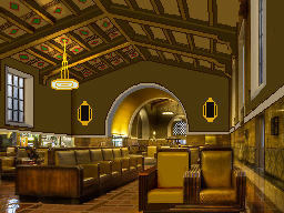
This is way, way, way beyond my level, but I might try that mask-mixing trick to give more depth to my Union Station scene.

4. Finally, do something stupidly hard, gradually, over many many weeks, and don't give up. It might turn out terrible, but it's always best to stretch.

5. Take at least one art class at some point? I probably could have save a lot of pain with more formal training.

--
Where do you find those amazing reference photos to begin with? oAo
Google Image Search! Or I take photos, if I'm in a location that's likely to make a good game scene. But usually Google Image Search.

This probably raises royalty issues, so I never use photos that anybody's likely to make a big deal about?

---

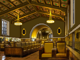
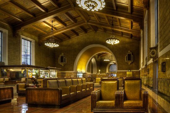
I've gotten back to work on Union Station. Here's more progress on that ceiling. If I had set up some kind of perspective grid properly from the beginning, this wouldn't be so murky now, but maybe it's for the best; the ceiling shouldn't be drawing too much focus in the final shot anyway.

That said, next time I'm in LA, I should go to Union Station's beautiful Art Deco waiting room just to stare at the ceiling and SCREAM IN INCOHERENT RAGE AT IT.

Image
"A slow sort of country!" said the Queen. "Now, here, you see, it takes all the running you can do, to keep in the same place. If you want to get somewhere else, you must run at least twice as fast as that!"
Phantom

Re: Adapted sprites by Ferdie Lance (critique encouraged)

Post by Phantom »

It's starting to get more realized.
User avatar
Aer
Posts: 232
Joined: Thu Jul 05, 2012 5:01 pm
Gender: Female
Spoken languages: English

Re: Adapted sprites by Ferdie Lance (critique encouraged)

Post by Aer »

The roof is starting to work out wonderfully. Also the right chandelier's strings :3 You certainly got your work cut out for you, but its going to look great when you're done, I bet!
(looking at some AA backgrounds, I was a little dissapoint to see that they used noise in some of them. But it did help it blend [plus, I guess a character would be the focal point, so the background didn't matter so much...]. Maybe you can test that out and see if it works for you?)
--
I like to scratch sprite. Feel free to ask if you need anything :3
Not very experienced at backgrounds, action shots, nor evidence, but I'd love to try.
User avatar
Ferdielance
Posts: 778
Joined: Sun Mar 09, 2008 12:46 am
Gender: Male
Spoken languages: English

Re: Adapted sprites by Ferdie Lance (critique encouraged)

Post by Ferdielance »

Just a little logo to show that I'm still doing bits and pieces, in spite of work and RP and so on:

Image
"A slow sort of country!" said the Queen. "Now, here, you see, it takes all the running you can do, to keep in the same place. If you want to get somewhere else, you must run at least twice as fast as that!"
Phantom

Re: Adapted sprites by Ferdie Lance (critique encouraged)

Post by Phantom »

Cool, except for the antialias going on with the outline of the whole thing (apparent with the rats tail).

You should disable antialias in your image editing program. OR, use a vector program to get a better, clearer crisp outline.

Here, you'll see the difference...I had to do abit of image hack since it's hard to do editing of the outlines already present. I couldn't create my own online, so I had to heavily edit yours:
Image
and just for fun, color editing to make the gradient more apparent:
Image

It looks better, but my issue is the rat's tail outline is apparent in regards to antialias. Still, the overall outline can compensate somewhat for it.

Here's what the tail would look like in a vector (only the tail):Image

See the big difference?

Also, when you worked on this Ferdie, did you have a .PSD/.PDN file with the white background as a separate layer? Or did you work off a white background?

If you worked off the white background, then for future reference, try to leave the white background alone and work your stuff on a separate layer (when possible, not a requirement, but it could make your life easier depending on what you need to accomplish)
Post Reply