Tyadran's Art - Tips and Critique Welcome

Showcase your artistic creations, whether that be sprites, music, drawings or literature, and whether they be related to the Ace Attorney universe or not.

Moderators: EN - Assistant Moderators, EN - Forum Moderators

Post Reply
User avatar
Tyadran
Posts: 6
Joined: Tue Feb 25, 2014 10:41 pm
Gender: Male
Spoken languages: English
Location: In an alternate dimension

Tyadran's Art - Tips and Critique Welcome

Post by Tyadran »

Hi!
I'm a newbie spriter (really terrible at it, seriously), but want to make a bunch of OCs and stuff for my trials, so, the plan is to post them here, and you all can help give me some pointers and feedback on them so I can get better.

Please note that you may not use any of my work without my explicit permission.

So without any further ado...
Spoiler : Alan Light :
ImageImage
ImageImageImage
(Deskslam is terrible and lazy, I'll get back to it once all these talking ones look decent.)
Spoiler : Damien Umbra :
ImageImage
(Very early in progress.)
Feel free to give me tips and let me know what you think! :D
Sometimes, I mod games.
And sometimes, other games.
And even other times, I make videos of me playing games.
User avatar
mercurialSK
Posts: 297
Joined: Sat Jan 11, 2014 9:26 am
Spoken languages: English
Location: foolishly fooling like a foolish fool
Contact:

Re: Tyadran's Art - Tips and Critique Welcome

Post by mercurialSK »

Hey, welcome to AAO.

I think you should give yourself more credit, actually. The deskslam may be lazy but the way the forearm is animated is pretty neat. The highlight and the extra frame of sleeve movement is nice, even if not strictly AA style (which is lazy and doesn't care about physics so much). Though... it doesn't look like the highlight colour is present anywhere else on the same sprite?

My advice would be to look at consistency and clarity. Consistency would include the colours used as well as being careful to match the seams (Look at how the sleeve is attached across all of Alan's poses, it's most evident in the deskslam but is still there between "arm down" and "arm on waist"). Clarity is there in how it's actually possible to tell that Alan's deskslam is supposed to be forceful but lazily carried out since the arm is alright, but it's missing in Damien's sprites because it's pretty difficult to tell what he's wearing. Black is a hard colour to draw into clothing because it absorbs a lot of layering shadows - this is usually overcome by colour segmentation or by separation of texture.

Also... how closely are you intending on following the AA style?
Image
Backlog: v6 Perceive generator, Apollo, everything else (My thread)
Someday, on AAO™: Chris Tenson: Ace Attorney & A Turnabout Called Justice (pt 2)
User avatar
Tyadran
Posts: 6
Joined: Tue Feb 25, 2014 10:41 pm
Gender: Male
Spoken languages: English
Location: In an alternate dimension

Re: Tyadran's Art - Tips and Critique Welcome

Post by Tyadran »

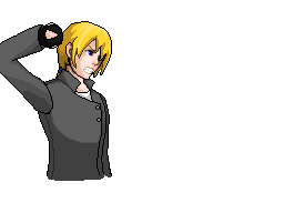
mercurialSK wrote:I think you should give yourself more credit, actually. The deskslam may be lazy but the way the forearm is animated is pretty neat. The highlight and the extra frame of sleeve movement is nice, even if not strictly AA style (which is lazy and doesn't care about physics so much). Though... it doesn't look like the highlight colour is present anywhere else on the same sprite?
I'm just hedging my bets - past adventures in spriting haven't been too pretty. I don't think that highlight colour is present anywhere else... Hmm, maybe that should change.

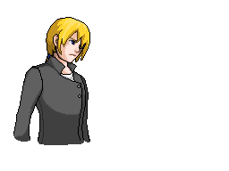
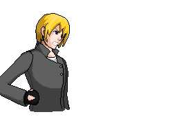
mercurialSK wrote:My advice would be to look at consistency and clarity. Consistency would include the colours used as well as being careful to match the seams (Look at how the sleeve is attached across all of Alan's poses, it's most evident in the deskslam but is still there between "arm down" and "arm on waist").
I hadn't noticed the seam difference between the Idle and Post-Deskslam animations. I'll have to fix that. The Deskslam difference is because I literally flipped the arm upside down and did some edits. XD

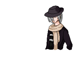
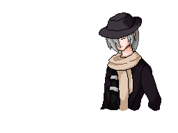
mercurialSK wrote:Clarity is there in how it's actually possible to tell that Alan's deskslam is supposed to be forceful but lazily carried out since the arm is alright, but it's missing in Damien's sprites because it's pretty difficult to tell what he's wearing. Black is a hard colour to draw into clothing because it absorbs a lot of layering shadows - this is usually overcome by colour segmentation or by separation of texture.
Damien's supposed to be wearing a dark-purple trench coat. Maybe I'll lighten it up a bit to make it easier to see.

mercurialSK wrote:Also... how closely are you intending on following the AA style?
Well...as you may be able to tell, they're not very close, eh? In all honesty, I would love to have them follow AA style, but there is nooo way I could actually replicate that, so I've got this strange little hybrid style going on. I think it looks somewhere between Pokemon and AA sprites, in my opinion.
I don't think it should be a problem, since I'm planning to do 95%-100% of the sprites for cases I use these on if I get a little better at it (or improve my work ethic), but I'd like them to at least look like a cousin to AA sprites.
Sometimes, I mod games.
And sometimes, other games.
And even other times, I make videos of me playing games.
Post Reply